How To Style An Art Ledge With Minted
Jun 25, 2020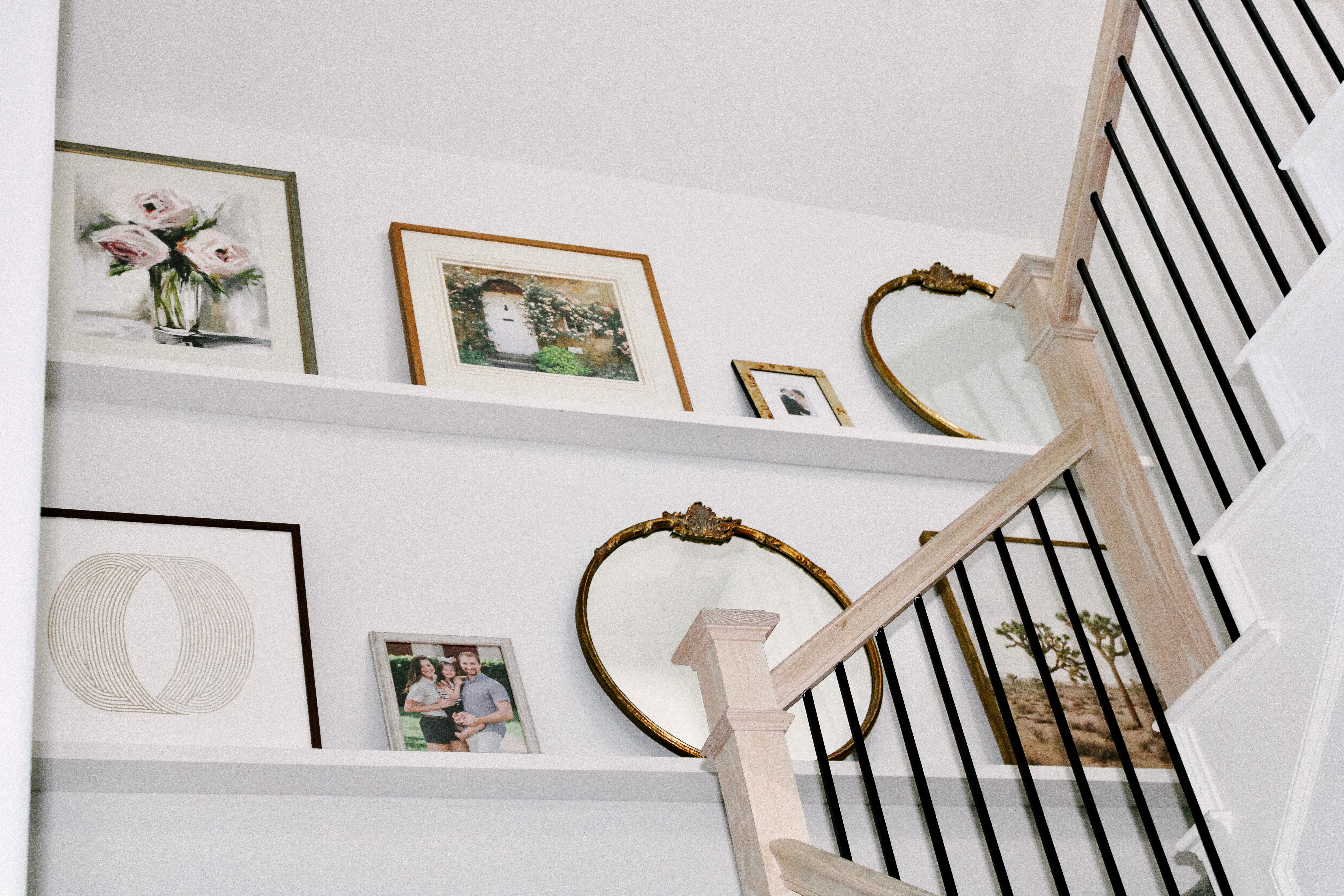
Details:
Thank you to Minted for sponsoring this post.
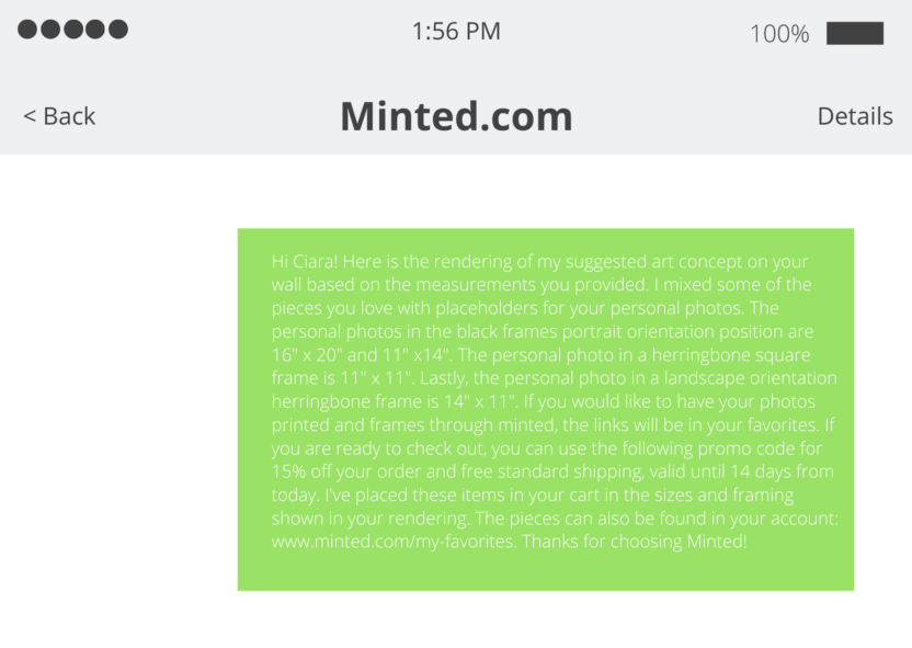
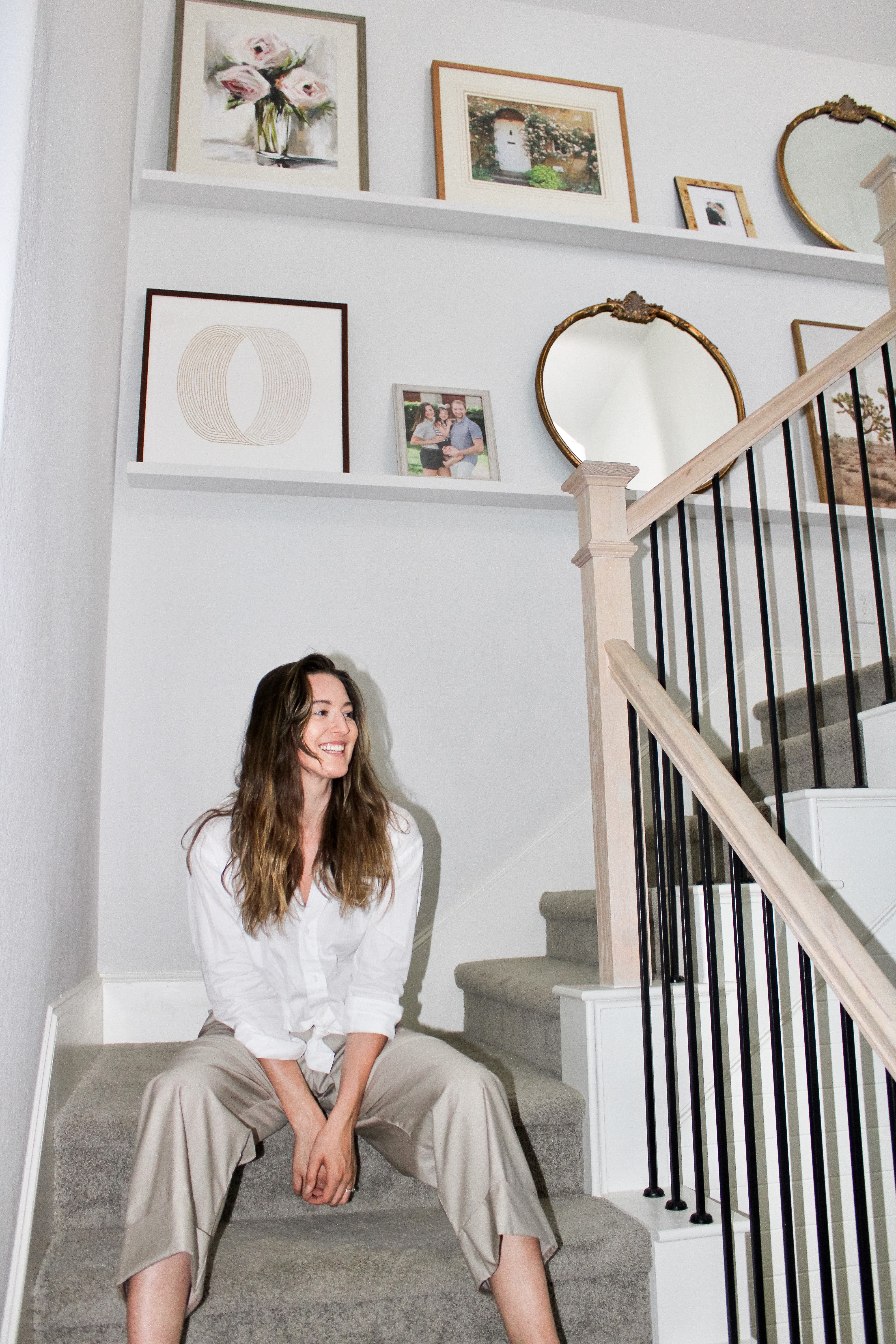
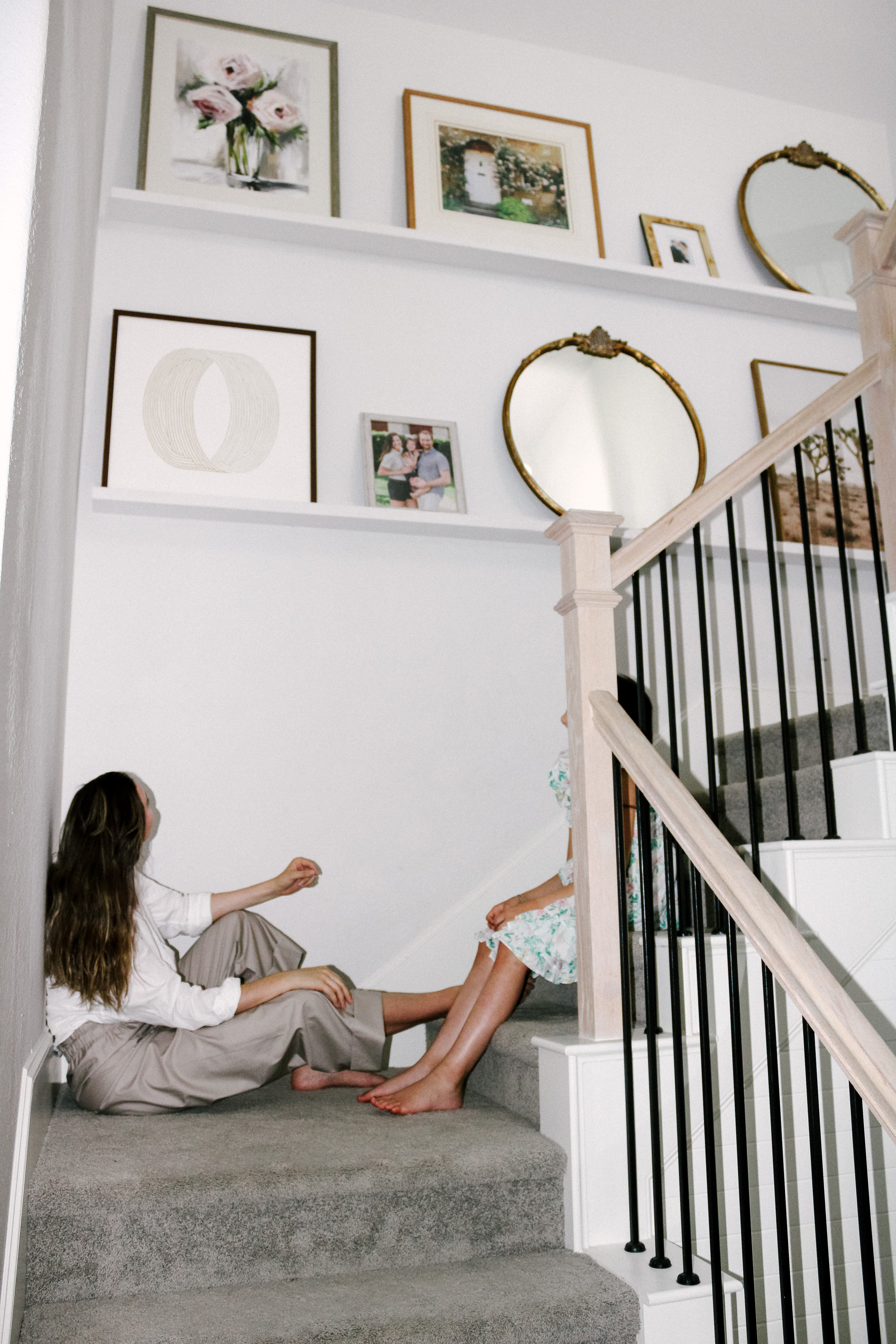
As you already know from this post, I love creating a space that feels personal and not too trendy. I want to be surrounded by items I’ve collected over time that mean something. Imperfect but intentional. Lots of white space with earthy elements. Symmetrical but lived in. I’m lounging around on vacation today, so I thought I would show you guys my current art ledge. I’m still adding and removing things and likely won’t ever really be finished, but it’s a fun project nonetheless! Plus, you guys are basically family at this point, so showing the process might be more interesting than the final result. I asked Minted.com for styling advice and they quickly texted back a rendering of my wall with some ideas (for free). Here is the original text:
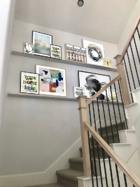
I like this rendering, but I know that my dog will knock off the filler pieces. My art ledge is thick, but sometimes Zoey slams into that wall for no reason – and with an active, explorative baby on the loose – I just don’t want the risk of anything falling off. I opted for large, focal pieces and two small personalized pieces instead. Some of the artwork came from talented artists at local boutiques. The photo of the Joshua Tree in the far right bottom corner came from a collaboration between Minted.com and Target. The far left bottom corner came from Minted.com. The mirrors came from Anthropologie.
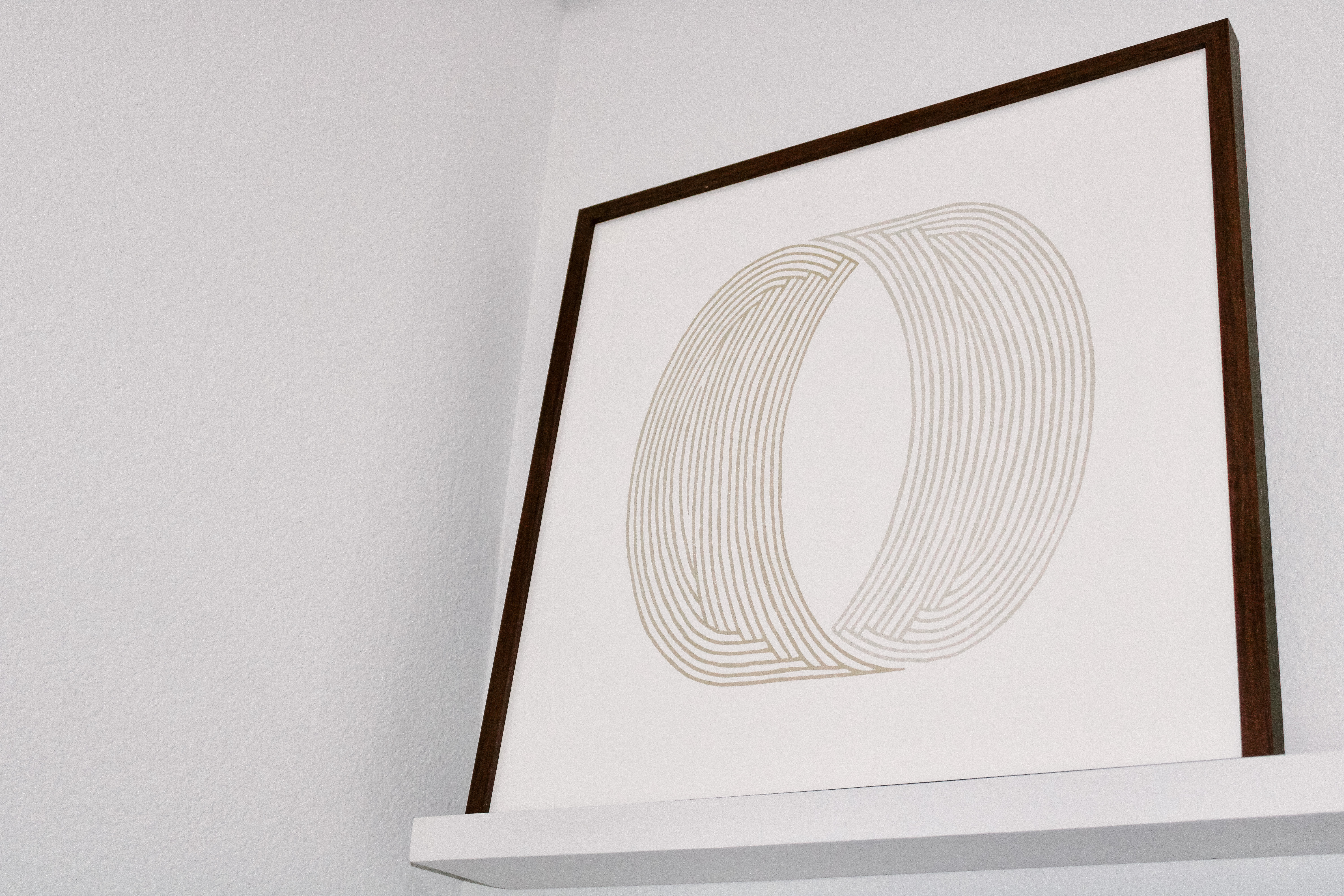
We recently had impromptu family portraits taken with Averi so I’ll add an updated family photo to this art ledge as soon as we get the pictures back from the photographer. I like to find artwork that speaks to me. I found this piece called “Thumbprint” and purchased it with a walnut frame handcrafted from Italy. The image is standard inside of the frame (full bleed reproduction with artwork extending to the edge). Each time I look at the “Thumbprint” artwork, I’m reminded that no two people in the world are exactly alike. Each thumbprint is unique just as each person is unique. I believe that individuality is a beautiful thing to embrace and teach our children about – rather than leading them into the comparison game that society tells us we should be playing. If you are interested in getting the “Thumbprint” for your space, you can choose from several sizes and gorgeous frames here. I don’t make commission or anything – I just think it’s a beautiful, neutral piece that can be mixed with several styles.
Words From The Artist:
“This print was so relaxing to create. No matter how you look at the circle, it does not end. I hope that this forever shape will bring you comfort and balance as much as it gave me in making it.”
Other Pieces I’m loving:
The Old Neighborhood – read more about it here
The Balancing 2 – read more about it here
Seated Figure – read more about it here
Fern – read more about it here
Here are a few tips on how to hang your artwork with step by step instructions. If you like a more uniform look but don’t know where to begin, I suggest browsing the fine art pairs section here.

2 Comments
Comments are closed.

 Faith
Faith
 Lifestyle, Style
Sharla
Love the wall, but what about if I only have a ledge that is 4’ long? Do you suggest multiple small pieces? Thanks in advance for your thoughts!
VeiledFree
Great q! I think it’s personal preference. I like larger vertical pieces mixed with smaller pieces to add a multidimensional feel. I also think adding large (maybe even skinny vertical pieces) would make your space appear bigger because it draws the eyes upward. As long as you surround yourself with pieces you love though, you can’t go wrong!